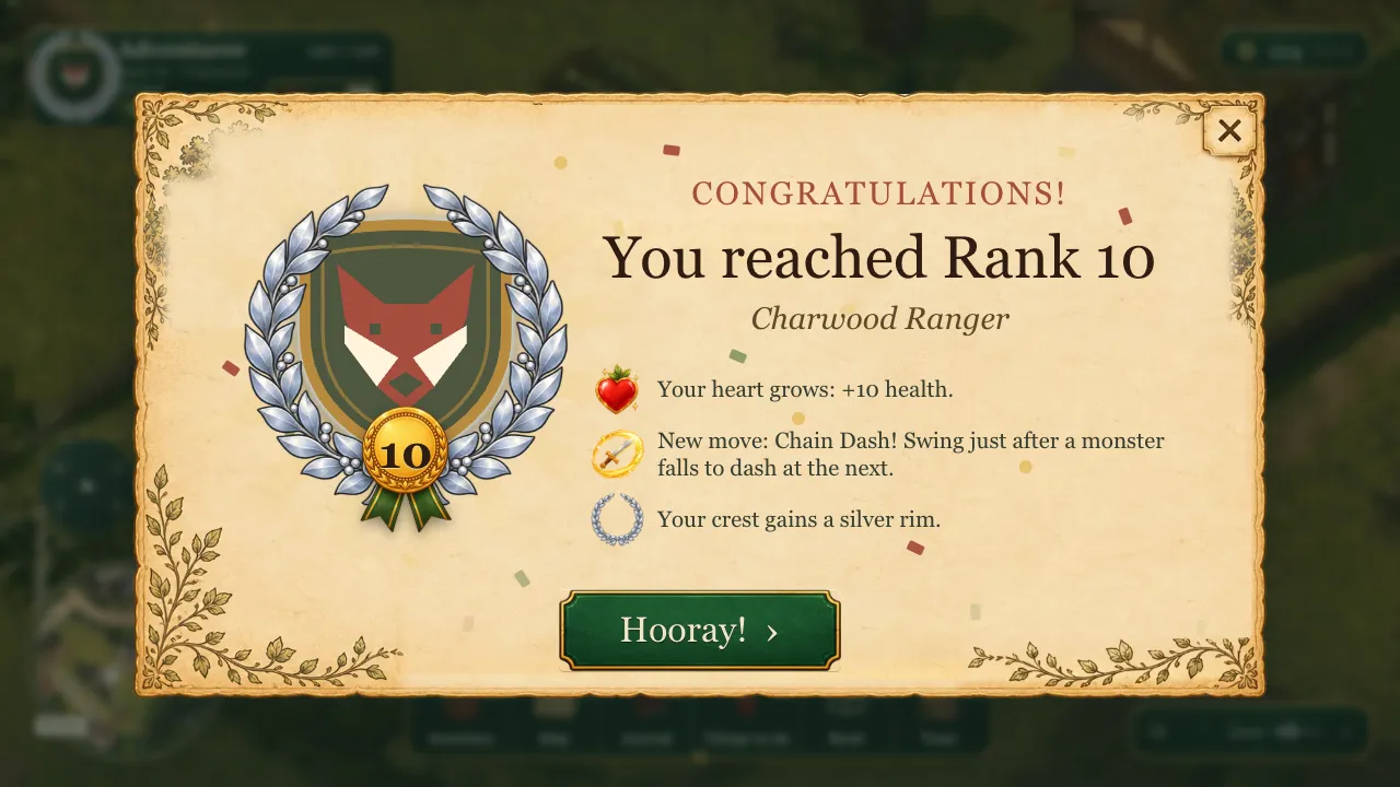
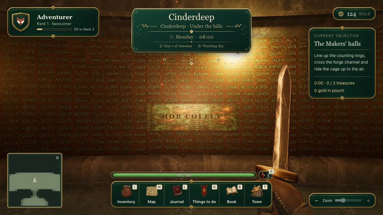
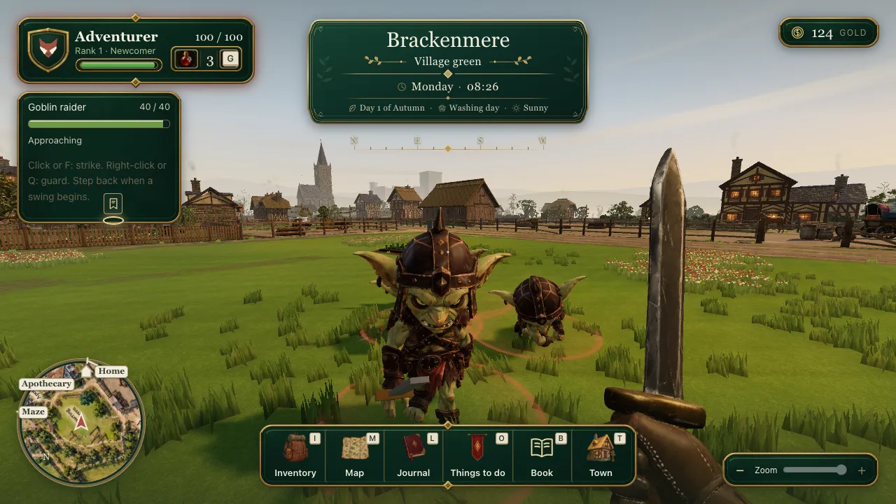
Brackenmere was built at a desk. Every control assumed a keyboard and a mouse: W, A, S and D to walk, E to use, F or a click to swing, Q to guard, the mouse to look around in first person. The screen was full of little key caps telling you which letter did what.
Children, though, mostly play on tablets. A game they could only play at my desk was going to stay a game they played at my desk. So on 31 October Brackenmere went onto an iPad, held sideways, with no keyboard attached.
This is the story of that port: what had to change, the choices along the way, the parts that were harder than they looked, and what still needs a real iPad in real hands.
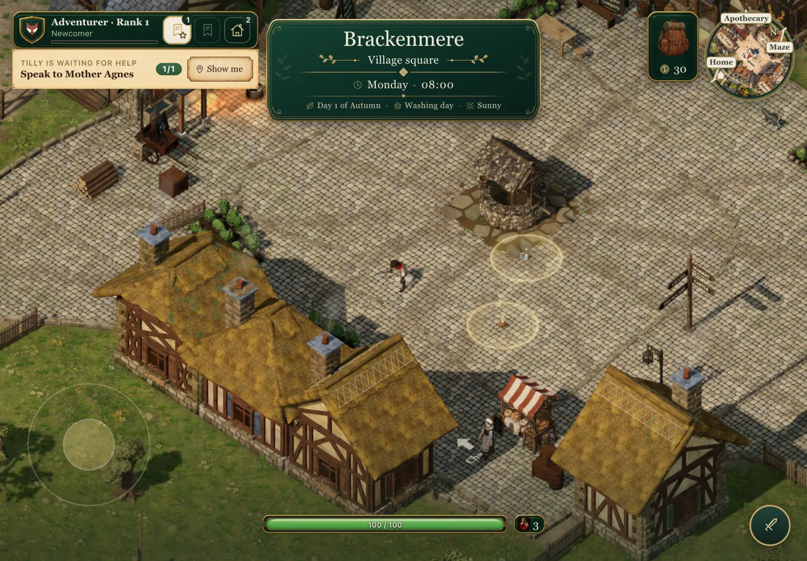 Arriving in the village on a touch screen. No key caps anywhere: a faint ring where the left thumb goes, a small sword where the right thumb goes, and the place banner shown large for a moment before it shrinks.
What an iPad saw before
The first job was to look honestly at the game as it stood, at iPad size.
Nothing on the screen could move the hero by touch. Eleven key caps were drawn across the interface. The two bottom corners, exactly where thumbs rest when you hold a tablet by its sides, held the minimap and the zoom and sound box: the two things a player touches least. And first person depended on the browser capturing the mouse, which iPad Safari only allows when a real mouse or trackpad is connected. Whatever else we chose, first person needed a new way to look around.
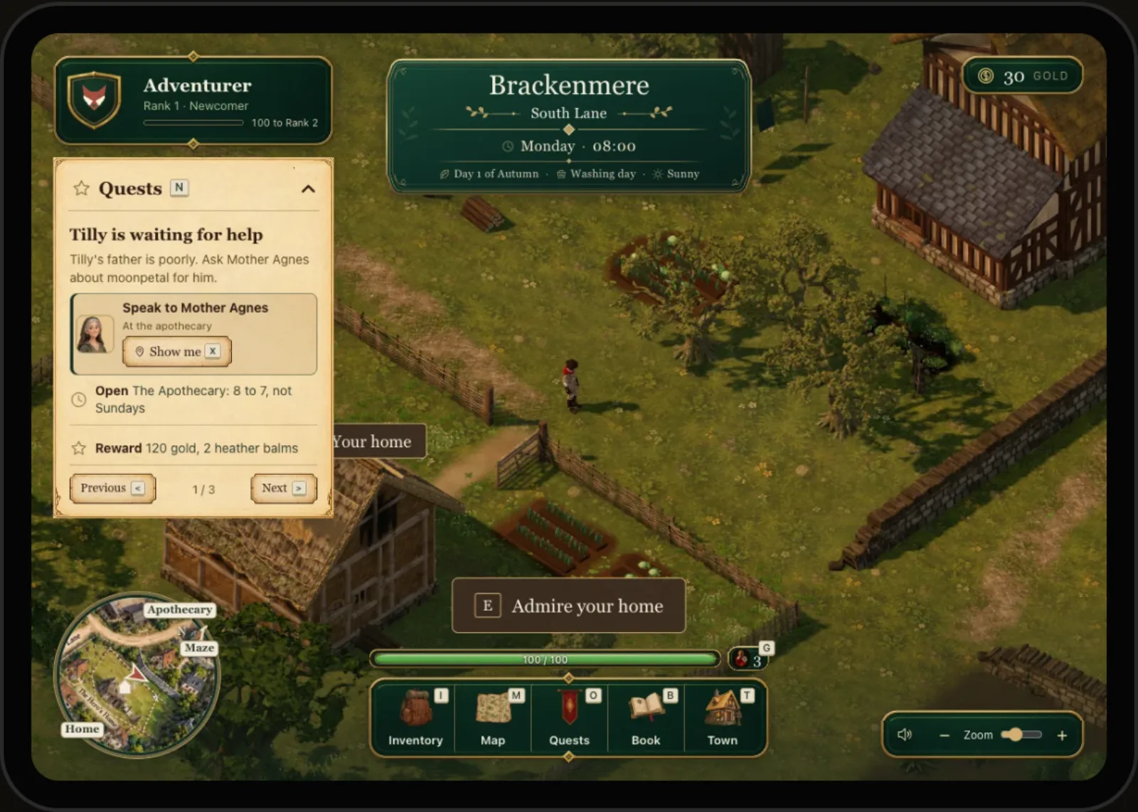 The game as it was, drawn at iPad Air size. Every button carries a key letter, and the bottom corners belong to the minimap and the zoom slider.
Eight ideas, drawn over the real game
Rather than guess, the morning started with research. Eight control concepts were drawn over real frames of the game at iPad Air size, four for the overhead view and four for first person, each borrowing from a game that already plays well on touch. Drawing them over real frames meant the button sizes and what they covered were true to the device.
Some were rejected quickly. Tap to go, where you tap the ground and the hero walks there, was the calmest and most child-friendly, but fiddly for precise jumps and the guard-then-kick timing the combat relies on. Edge rails, with every piece of information on one thin strip along the top, cleared the most of the world but felt more like an action game than a town to live in. Tilt to look, turning the tablet itself to look around in first person, stayed on the list as a possible setting for later.
The one I picked was Calm and fight: a screen that changes with the moment. In town it is nearly empty. When something notices the hero, the fight controls arrive.
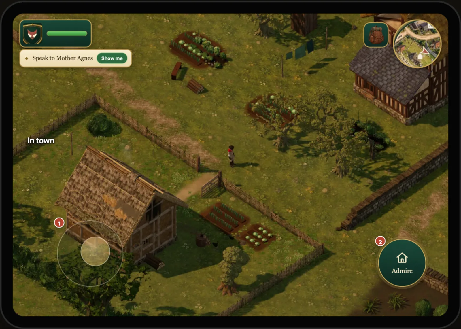 The concept, not the game: Calm and fight as first drawn. In town, a faint stick and one big button for whatever is nearby.
That concept was then worked up state by state: arriving, someone in reach, talking, jumping, things in reach, danger, fighting, pinching into first person. A third round redrew the corners so that the rank and the quest tabs share one card, gold sits on the satchel, and the potion is a small chip beside the health bar.
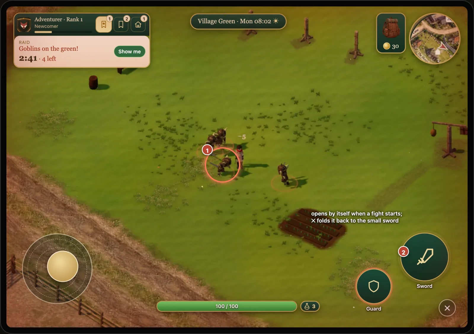 The concept for danger: the sword dock opens by itself when a fight starts, and the cross folds it back to a small sword.
Two ideas from the concept did not survive contact with the details. The one big "use" button under the right thumb became a label on the thing itself, so you tap the door rather than a button that stands for the door. And the fight cluster stopped sliding in and out: a small sword now sits in the corner all the time, because a quest can ask you to break a crate in perfect peace.
A stick that appears under your thumb
Movement is a floating stick. Put your left thumb down anywhere in the bottom-left part of the screen and the stick appears under it. A small push creeps, a bigger push walks, and pushing right out to the edge runs. When no thumb is down, a faint ring shows where a thumb naturally lands, kept clear of the edge so it never meets Safari's swipe-back gesture.
Keyboard play has three separate controls for this: walk, tap twice to run, hold Shift to creep. An analogue stick gives you all three from one gesture, which is the main reason a stick won over the alternatives.
The direction is analogue too: you can walk at any angle, not only the eight a keyboard gives you. The speed is not. Each gait keeps its own speed, so a half push is a walk, not a slow run. If that feels wrong on a real iPad, a speed curve can come later.
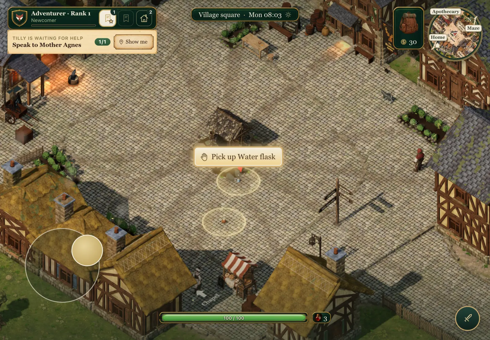 The stick pushed to the edge: running. The water flask by the well is in reach, so it wears a lit label to tap.
Tap the ground to jump, tap the label to use
Jumping has no button. A quick tap on open ground jumps, whether you are standing or running, and a tap while running is a running jump. That frees the right thumb and keeps the screen clear.
The hard part is deciding what a tap is. A finger that lands and lifts quickly without moving is a tap. A finger that drags is something else: a look in first person, a push of the stick, or nothing at all. Getting this wrong means a hero who jumps every time you look around, which is exactly the kind of thing that makes a touch game feel broken.
Using things works the same way it does in many touch games: the prompt becomes the button. With a keyboard, a card at the bottom of the screen said "E: Admire your home" and you pressed E. On touch, the thing in reach wears a lit label over it with its action in words, and you tap the label. A door with two actions shows two labels side by side.
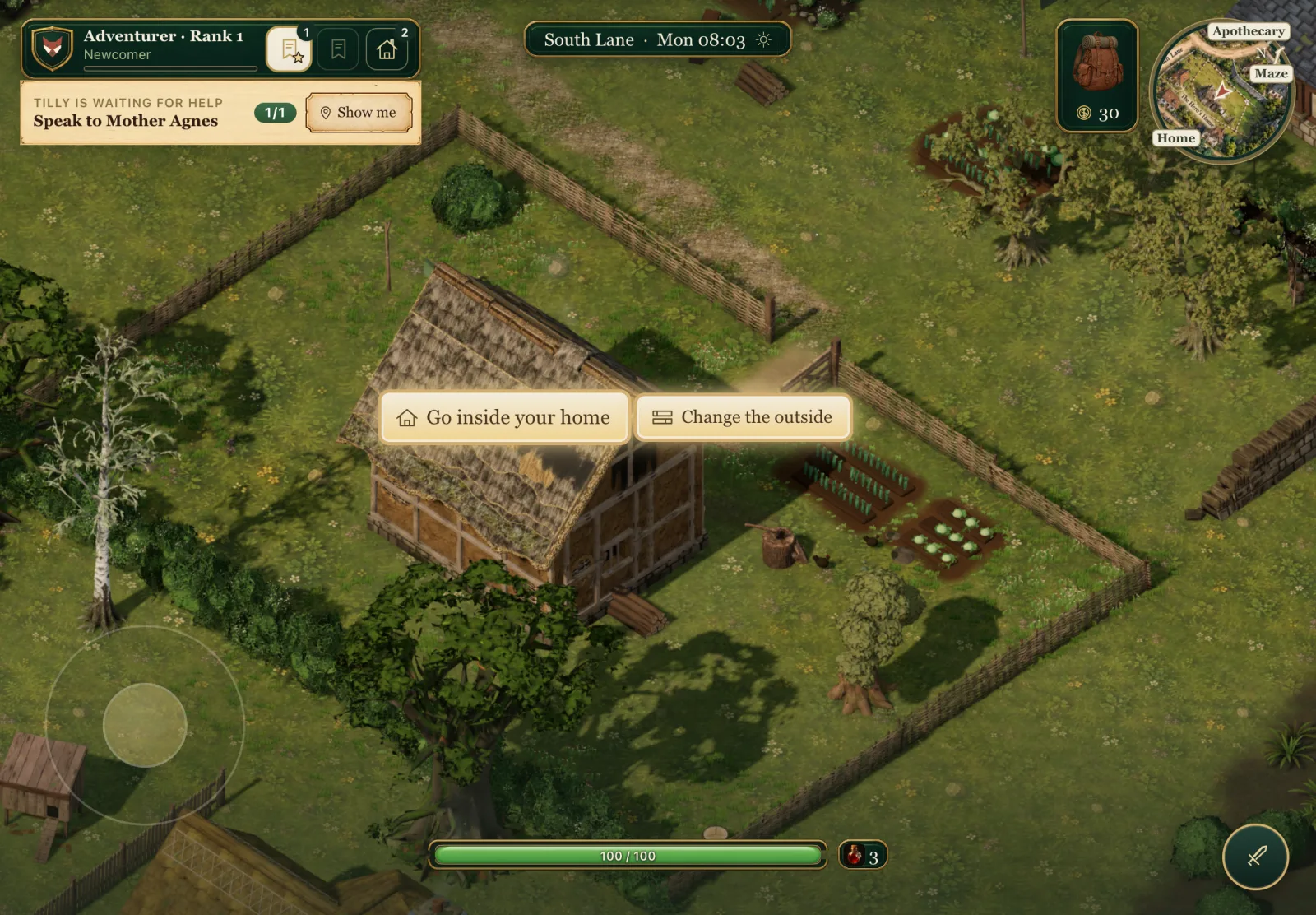 At the home door: two actions, two labels. With keys these were E and R.
Under the hood A tap is judged on how far the finger ever strayed (under 10 px) and how long it was down (under 250 ms), not on where it lifted, so a drag that comes back to its start is still a drag. Each finger gets one role when it lands and keeps it until it lifts: stick, pinch, look or tap. Two fingers in a pinch never become taps or jumps, even when one lifts before the other. A tap within 60 px of the thing in reach uses it instead of jumping.
Tap to talk
People get the same treatment, in a form that fits them. When someone is close enough to talk to, their name tag lights gold with a small speech mark. Tap the tag and the conversation opens. Tap the name of someone across the room and the tag gives a little shake: you need to walk over first.
This was kept separate from the quest marks over people's heads. A gilt mark means "has something for me"; a lit tag means "close enough to talk". Both can be true at once, and a child should be able to read each on its own.
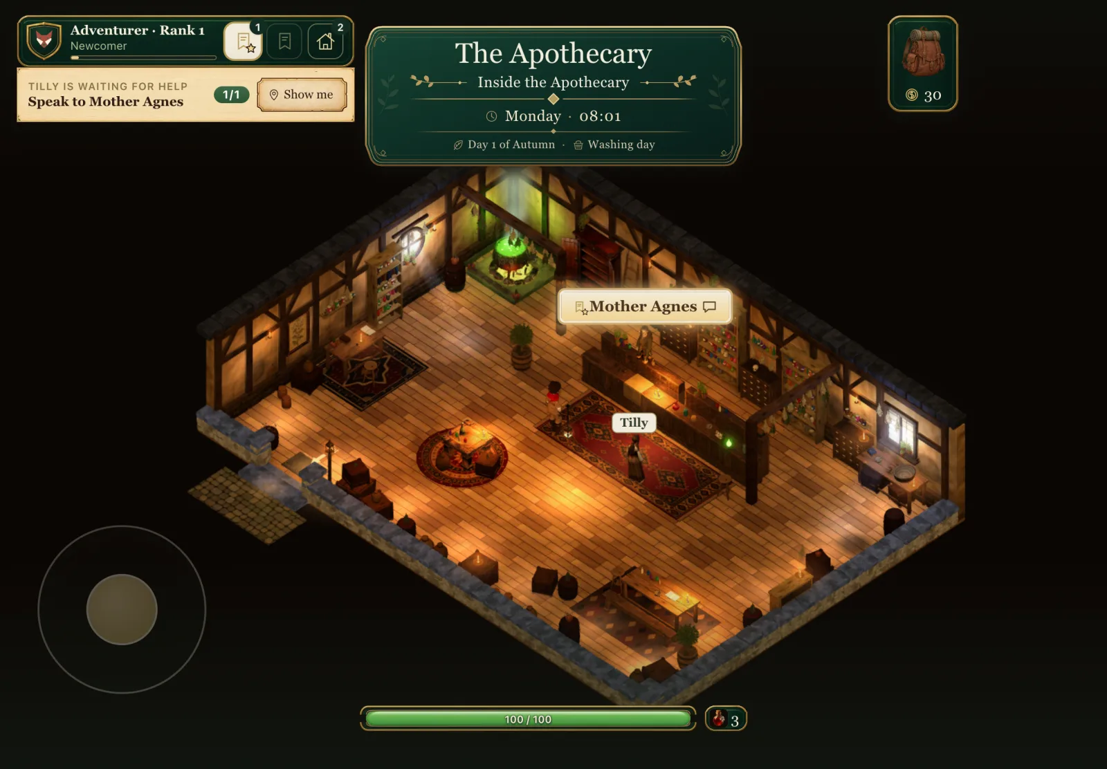 Mother Agnes is in reach, so her tag is lit and tappable. Tilly's is plain: too far to talk to.
The conversation itself already used large reply cards. On touch the replies are tapped, and the footer says so in words rather than showing number keys.
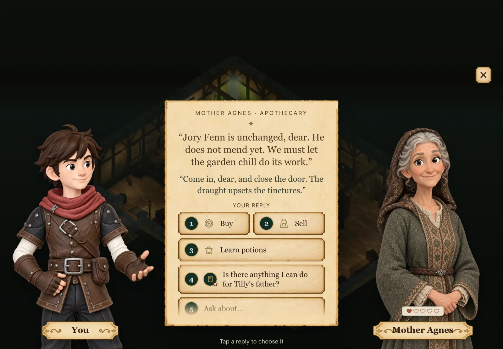 One tap on the tag opened this. "Tap a reply to choose it" replaces the keyboard's hint.
A sword that folds away
Combat was the part I worried about most. Brackenmere's sword has a small vocabulary: a swing, a charged spin, a slam from the air, a kick with the guard up, a dropkick while running, a dash after a win, and stepping aside while guarding. All of it had to survive the move from keys to thumbs.
The answer is the sword dock. In the bottom-right corner there is always a small round sword. Tap it and two buttons fan out: a big Sword and a smaller Guard, with a cross where the small sword was to fold them away. It also opens by itself when a monster notices the hero, and folds itself a few seconds after the last threat is beaten or gone. If you opened it by hand, it stays open. If you fold it in the middle of a fight, it stays folded until the next fight starts.
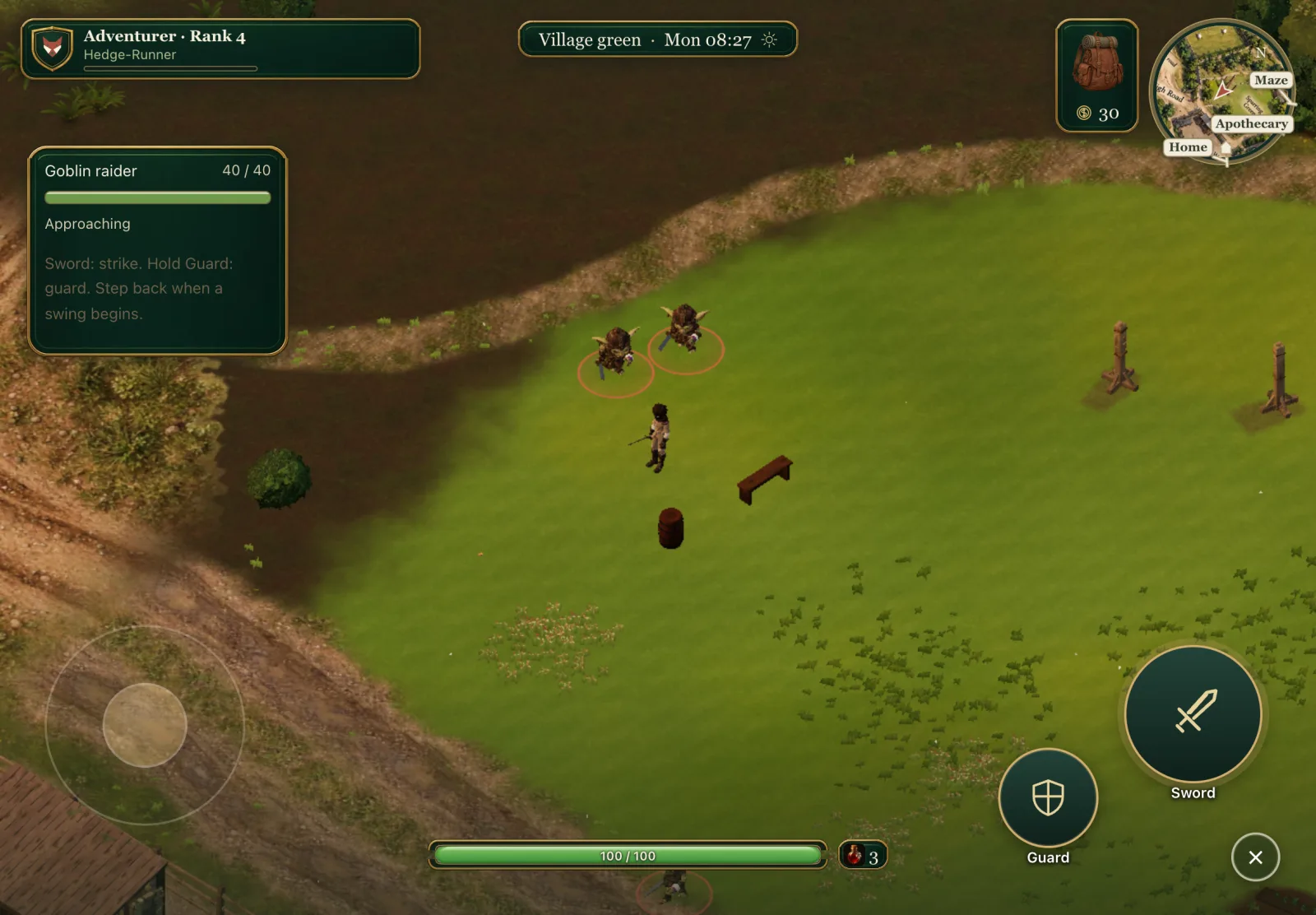 A raider engages and the dock opens by itself. Even the enemy card speaks touch: "Sword: strike. Hold Guard: guard."
The important decision was not to invent new combat for touch. Sword presses and releases exactly as the attack key does, so every existing move comes through the same rules: hold and let go to spin, Sword in the air to slam, Sword with Guard held to kick. Guard is held while your thumb is on it, and flicking the stick sideways while guarding steps aside, just as the side keys do with a keyboard.
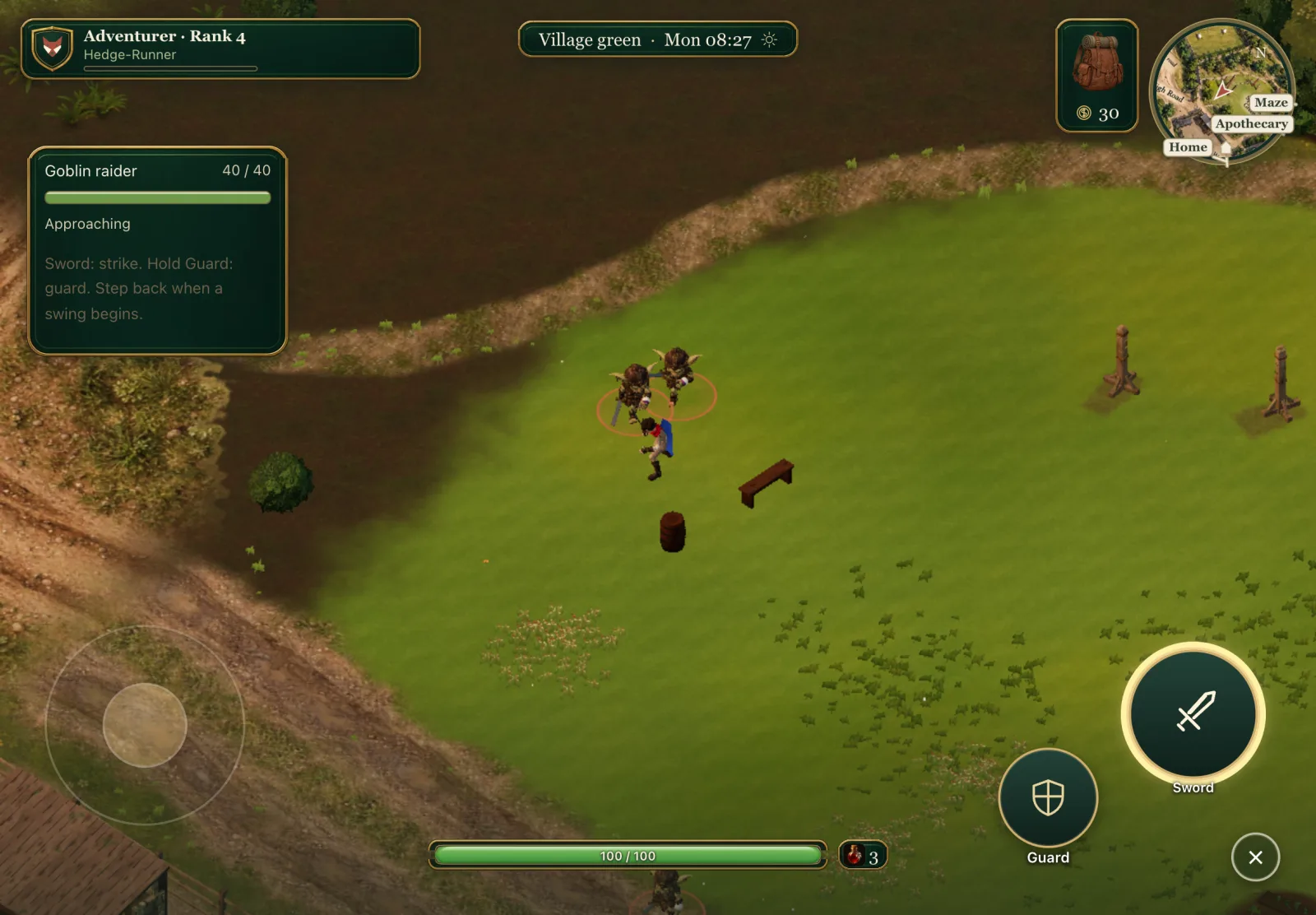 Sword held: the button glows while the spin charges. Let go and the hero spins.
The difficult part was the opposite of pressing: letting go. A touch can be taken away without the finger lifting. A panel opens, the browser decides a gesture is its own, the tab is hidden, the view changes. Each of those has to cancel what the finger was holding, not release it. A released Sword after a long hold is a spin; a cancelled one must be nothing at all, otherwise opening your satchel mid-charge would spin the hero. The same goes for a guard left up, or a run that never stops because the browser swallowed the lift.
Under the hood Touch feeds the combat input as its own sources, so cancelling touch never releases a keyboard key or the mouse button and the other way round. The input machine gained a
cancel(source)beside its press and release. The dock counts a monster as a threat when it is within 14 m and alerted, or, for village raiders who have no awareness of their own, when it is alive and engaged. Browsers also send pretend mouse clicks after a touch for older websites; the touch layer swallows those so a tap on the canvas never doubles as a sword swing.
First person without a mouse
First person is where the keyboard and mouse assumption ran deepest. With a mouse, the game captures the pointer and moving the mouse turns your head. An iPad has no pointer to capture.
On touch, a one-finger drag that starts anywhere without an action of its own turns and tilts the view. Only the stick's corner is kept back, because a thumb landing there means walk. The view levels itself as you walk, as it already did. The card asking you to click to continue in first person never appears on touch, and the game never pauses for want of a mouse.
Getting in and out is a pinch. Spread two fingers to zoom the overhead view in; keep spreading past the closest zoom and you drop into first person. Pinch your fingers together in first person and you are lifted back overhead. It is the touch version of the keyboard's rule of pressing plus twice.
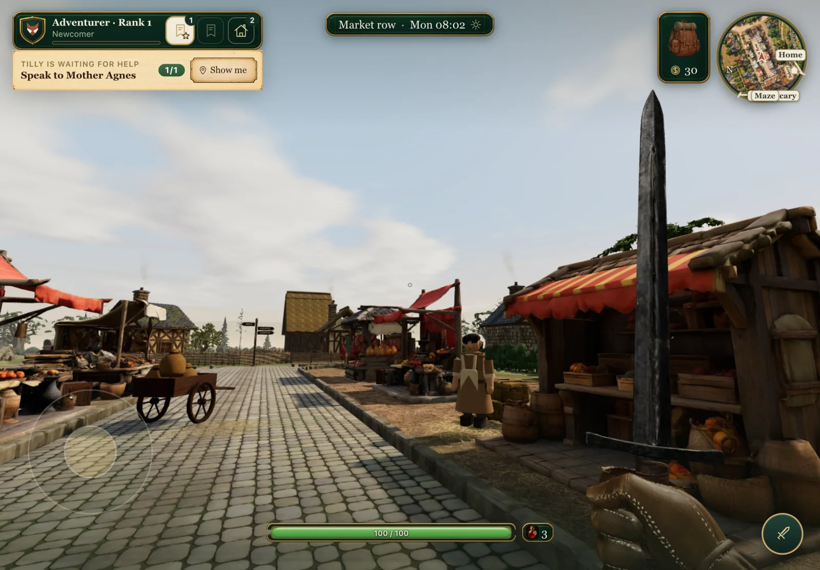 First person after a pinch, mid look drag. No mouse, no capture card, the same corners as overhead.
One more borrowing from phone shooters: in first person, holding Sword and sliding your thumb turns the view as you swing, so you can keep a goblin in front of you without lifting your thumb.
A slimmer screen
The interface went on a diet. The five panel buttons along the bottom are gone on touch: one tap on the satchel, top right, opens the panel on its last tab, and Settings joins the tabs there. The gold sits along the satchel's foot. Tapping the minimap opens the Map. Health stays bottom centre with a small potion chip beside it that you tap to drink, and that pulses when you are hurt. The big place banner shows on arrival, then shrinks to a one-line chip with the place, day, hour and weather. The zoom slider is gone, because pinching does its job.
The quest card was the biggest change. On a desk it is a tall parchment card. On touch it becomes one slim card: a green band with your rank and the Story, Errands and Home tabs, over a single parchment line with the current step and Show me. Tap a tab for its quest; tap the open tab again to fold the line away; swipe the line sideways for the next quest; tap the line and the whole card drops down, with Previous and Next big enough for a thumb.
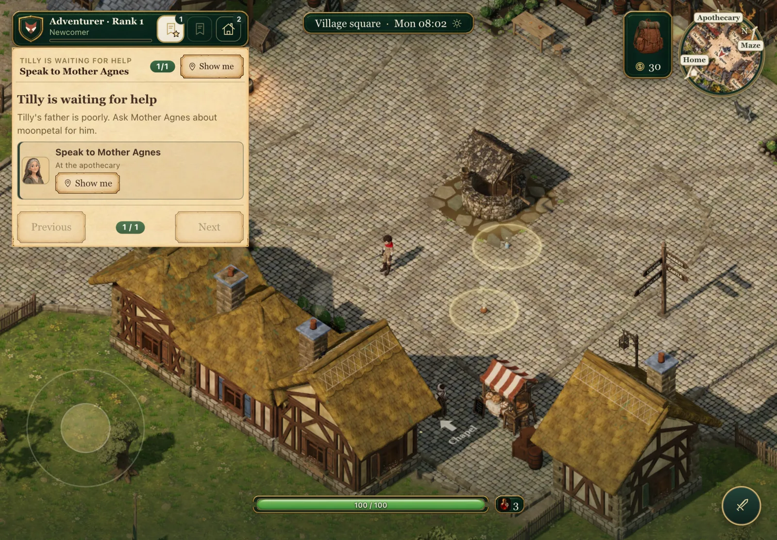 A tap on the quest line drops the full card, with Previous and Next sized for a thumb rather than a key.
One setting, live switching
An iPad with a Magic Keyboard is both kinds of device at once, and some laptops have touch screens. So the game has one switch, in Settings under Controls: Automatic, Touch, or Keyboard and mouse.
Automatic starts in touch on a device whose main pointer is a finger, then follows whatever you used last. Touch the screen and the touch layout appears; press a key and the key caps come back. It all switches live, with no reload. Forcing one mode never locks the other device out: a mouse can always reach Settings to switch back.
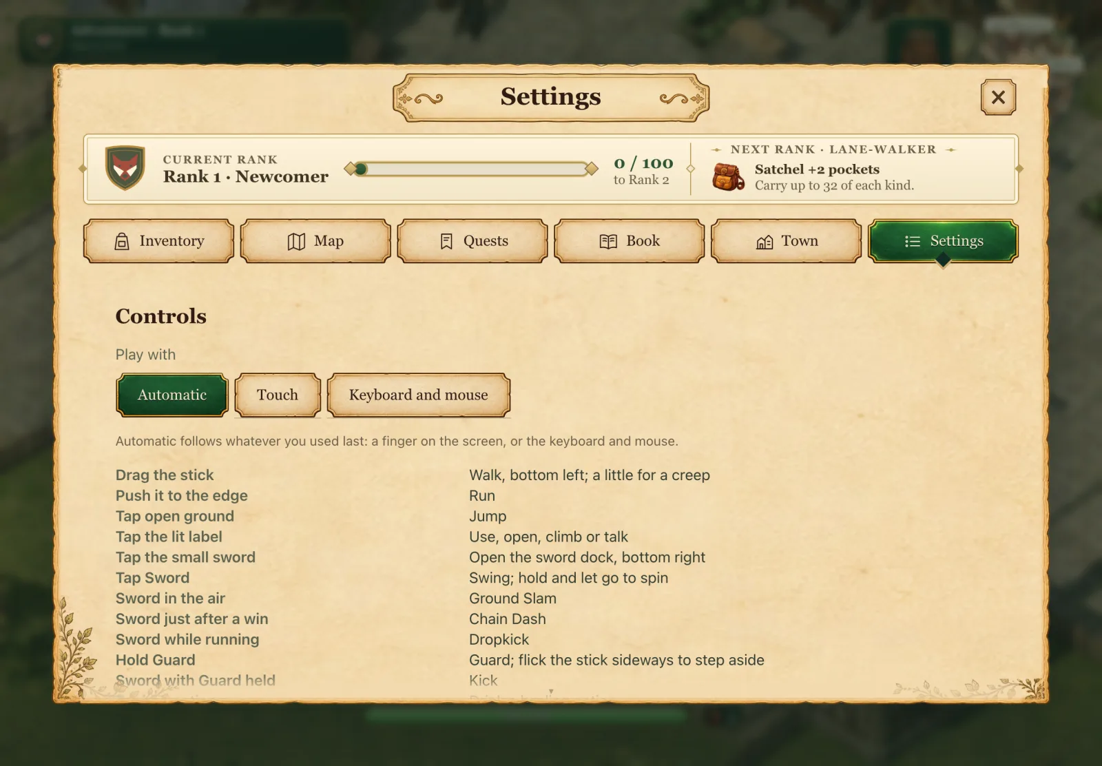 The Controls setting. In touch mode the list beneath is the touch controls, in plain words.
Words that never name a key
This turned out to be the largest single job, and the least visible.
Brackenmere talks to the player a lot. Tips, the potion card, the reward cards, notes about places, home prompts, the title screen, the storybook at the start, and above all Bram's controls lesson. Almost all of it named keys: "Press E", "Hold Q", "Press H at home". On a screen with no keys, every one of those is a small lie.
So every string that names a key now has a touch wording beside it, chosen when it is shown and redrawn if you switch devices mid-sentence. "[E] is for talking, and for using things" becomes "Tap a lit word to talk, and to use things". The story pauses with a tap, and the storybook gained a button to go back a page. A test reads the source and fails if a new key cap appears anywhere without a touch twin.
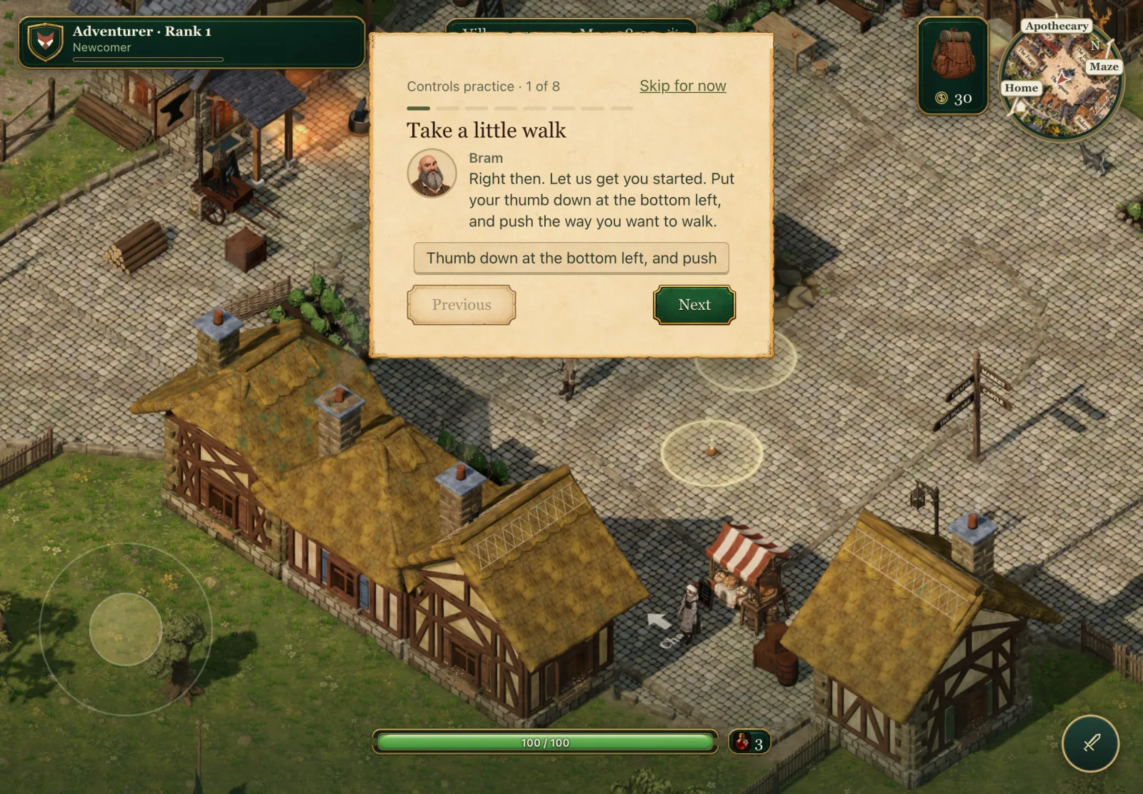 Bram's first lesson step on touch. With a keyboard he talks about the arrow keys; here he talks about thumbs.
Spoken lines were the awkward part. Bram's lesson and some of the narrator's tips are voiced, and a voice saying "press E" over a touch screen undoes all the careful wording on the card. They now have touch twins, recorded in the same voices: eight new takes for Bram's lesson, from the stick to the pinch, and seven for the narrator's tips. The game picks the right recording for the device you are using.
How it was built
All of this happened in one day. The concepts came first in the morning, then a plan with my decisions on each question the concepts raised. The work was split into eight pieces: the input mode and setting, movement and looking, the sword dock, tapping to use, the touch HUD, the words and voices, the quest card, and tapping to talk. Each piece was built by its own agent, at most two at a time, and reviewed by a second model in rounds until a round came back clean. The last two pieces waited for a separate stream of quest work to land first, because they changed the same quest card and name tags.
Every piece came with tests that drive real touches. The browser tests put fingers on the screen through the browser's own touch events, several at once where needed, and step the game's clock between them so a hold or a tap lasts exactly as long as the test says. That is how "a look drag never jumps" and "a cancelled hold never spins" became checks rather than hopes.
At the end, the whole route was walked in a touch browser at iPad size: arriving, walking, running, jumping, using a door by its label, the sword dock on the practice dummy, a raid opening the dock by itself, pinching into first person and back, a look drag, switching Controls, and the portrait card asking you to turn the device sideways. Everything passed. That is an emulated iPad, though, not a real one.
In the days since, playtesting turned up a few touch details worth fixing: the hunger chip now opens with a tap while your other thumb is on the stick, and the new first-person line that replaced the mouse capture card never shows on touch.
What is still open
The biggest open item is the one no test can do: a real iPad in real hands. There is a checklist waiting for that pass. Does the stick's resting ring sit where a thumb actually lands? Are Sword and Guard where the right thumb wants them? What is the frame rate after ten minutes in the village, and does the tablet get warm? Does "Add to Home Screen" open the game full screen, and does Safari ever give up on memory? And are the fifteen new voice takes any good?
Phones are later. Any touch device gets the touch layout, but it is tuned for a tablet, and on a phone held sideways the screen is cramped: the place chip overlaps the quest band, and some panels need their short-screen layouts reworked. That is its own piece of work.
There are a few small follow-ups too, like the bedtime directions on touch, which still assume the Home tab is closed. They are written down.
The game can now be played without a keyboard. Whether it feels right without one is the next question, and that one needs a child, a sofa and an iPad.